
1. Introduction
Compose for Wear OS lets you translate the knowledge you've learned building apps with Jetpack Compose to wearable devices.
With built-in support for Material You, Compose for Wear OS simplifies and accelerates UI development and helps you create beautiful apps with less code.
For this codelab, we expect you to have some knowledge of Compose, but you certainly don't need to be an expert.
We will be using Horologist which is an open source project built on top of Jetpack Compose, which helps developers accelerate app development.
You will create several Wear specific composables (both simple and complex), and, by the end, you can start writing your own apps for Wear OS. Let's get started!
What you will learn
- Similarities/differences between your previous experience with Compose
- Simple composables and how they work on Wear OS
- Wear OS specific composables
- Wear OS's
LazyColumn(ScalingLazyColumn) - Wear OS's version of the
Scaffold
What you will build
You'll build a simple app that displays a scrollable list of composables optimized for Wear OS.
Because you will be using Scaffold, you'll also get a curved text time at the top, a vignette, and finally a scrolling indicator tied to the side of the device.
Here's what it will look like when you are finished with the code lab:
Prerequisites
- Basic understanding of Android development
- Basic understanding of Kotlin
- Basic knowledge of Compose
2. Getting Set Up
In this step, you will set up your environment and download the starter project.
What you will need
- Latest stable version of Android Studio
- Wear OS device or emulator (New to this? Here's how to set it up.)
Download code
If you have git installed, you can simply run the command below to clone the code from this repo. To check whether git is installed, type git --version in the terminal or command line and verify that it executes correctly.
git clone https://github.com/android/codelab-compose-for-wear-os.git
cd compose-for-wear-os
If you do not have git, you can click the following button to download all the code for this codelab:
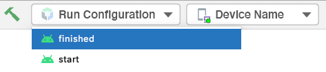
At any time you can run either module in Android Studio by changing the run configuration in the toolbar.
Open project in Android Studio
- On the Welcome to Android Studio window select
 Open an Existing Project
 - Select the folder
[Download Location] - When Android Studio has imported the project, test that you can run the
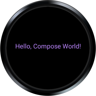
startandfinishedmodules on a Wear OS emulator or physical device. - The
startmodule should look like the screenshot below. It's where you will be doing all your work.
Explore the start code
build.gradlecontains a basic app configuration. It includes the dependencies necessary to create a Composable Wear OS App. We'll discuss what's similar and different between Jetpack Compose and the Wear OS version.main > AndroidManifest.xmlincludes the elements necessary to create a Wear OS application. This is the same as a non-Compose app and similar to a mobile app, so we won't review this.main > theme/folder contains theColor,Type, andThemefiles used by Compose for the theme.main > MainActivity.ktcontains boilerplate for creating an app with Compose. It also contains the top-level composables (like theScaffoldandScalingLazyList) for our app.main > ReusableComponents.ktcontains functions for most of the Wear specific composables we'll create. We will do a lot of our work in this file.
3. Review the dependencies
Most of the Wear related dependency changes you make will be at the top architectural layers (highlighted in red below).
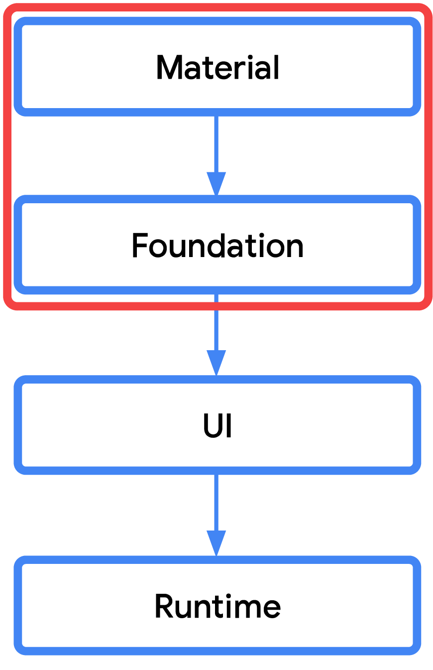
That means many of the dependencies you already use with Jetpack Compose don't change when targeting Wear OS. For example, the UI, Runtime, Compiler, and Animation dependencies will remain the same.
However, you will need to use the proper Wear OS Material, Foundation, and Navigation libraries which are different from the libraries you have used before.
Below is a comparison to help clarify the differences:
Wear OS Dependency(androidx.wear.*) | Comparison | Standard Dependency(androidx.*) |
instead of | androidx.compose.material:material ₁ | |
instead of | androidx.navigation:navigation-compose | |
in addition to | androidx.compose.foundation:foundation | |
in addition to | androidx.compose.ui:ui-tooling-preview |
1. Developers can continue to use other material related libraries like material ripple and material icons extended with the Wear Compose Material library.
Open the build.gradle, search for "TODO: Review Dependencies" in your start module. (This step is just to review the dependencies, you will not be adding any code.)
start/build.gradle:
// TODO: Review Dependencies
def composeBom = platform(libs.androidx.compose.bom)

// General compose dependencies
implementation composeBom
implementation libs.androidx.activity.compose
implementation libs.compose.ui.tooling.preview

implementation(libs.androidx.material.icons.extended)

// Compose for Wear OS Dependencies
implementation libs.wear.compose.material

// Foundation is additive, so you can use the mobile version in your Wear OS app.
implementation libs.wear.compose.foundation

// Compose preview annotations for Wear OS.
implementation(libs.androidx.compose.ui.tooling)

debugImplementation libs.compose.ui.tooling
debugImplementation libs.androidx.ui.test.manifest
debugImplementation composeBom
You should recognize many of the general Compose dependencies, so we won't cover those.
Let's move to the Wear OS dependencies.
Just as outlined earlier, only the Wear OS specific version of material (androidx.wear.compose:compose-material) is included. That is, you will not see or include androidx.compose.material:material in your project.
It's important to call out that you can use other material libraries with Wear Material. We actually do that in this codelab by including androidx.compose.material:material-icons-extended.
Finally, we include the Wear foundation library for Compose (androidx.wear.compose:compose-foundation) . This is additive, so you can use it with the standard foundation you've used before. In fact, you probably already recognized we included it in the general compose dependencies!
Ok, now that we understand the dependencies, let's have a look at the main app.
4. Review MainActivity
We will do all our work in the
start
module, so make sure every file you open is in there.
Let's start by opening MainActivity in the start module.
This is a pretty simple class that extends ComponentActivity and uses setContent { WearApp() } to create the UI.
From your previous knowledge of Compose, this should look familiar to you. We are just setting up the UI.
Scroll down to the WearApp() composable function. Before we talk about the code itself, you should see a bunch of TODOs scattered throughout the code. These each represent steps in this codelab. You can ignore them for now.
It should look something like this:
Code in fun WearApp():
WearAppTheme {
     /* *************************** Part 4: Wear OS Scaffold *************************** */
    // TODO (Start): Create a AppScaffold (Wear Version)

    // TODO: Swap to ScalingLazyColumnState
    val listState = rememberLazyListState()

    /* *************************** Part 4: Wear OS Scaffold *************************** */
    // TODO (Start): Create a ScreenScaffold (Wear Version)

    // Modifiers used by our Wear composables.
    val contentModifier = Modifier.fillMaxWidth().padding(bottom = 8.dp)
    val iconModifier = Modifier.size(24.dp).wrapContentSize(align = Alignment.Center)

    /* *************************** Part 3: ScalingLazyColumn *************************** */
    // TODO: Swap a ScalingLazyColumn (Wear's version of LazyColumn)
    LazyColumn(
        modifier = Modifier.fillMaxSize(),
        contentPadding = PaddingValues(
            top = 32.dp,
            start = 8.dp,
            end = 8.dp,
            bottom = 32.dp,
        ),
        verticalArrangement = Arrangement.Center,
        state = listState,
    ) {
        // TODO: Remove item; for beginning only.
        item { StartOnlyTextComposables() }

        /* ******************* Part 1: Simple composables ******************* */
        item { ButtonExample(contentModifier, iconModifier) }
        item { TextExample(contentModifier) }
        item { CardExample(contentModifier, iconModifier) }

        /* ********************* Part 2: Wear unique composables ********************* */
        item { ChipExample(contentModifier, iconModifier) }
        item { ToggleChipExample(contentModifier) }
        }

    // TODO (End): Create a ScreenScaffold (Wear Version)
    // TODO (End): Create a AppScaffold (Wear Version)
    }
We start by setting the theme, WearAppTheme { }. This is exactly the same way you've written it before, that is, you set a MaterialTheme with colors, typography, and shapes.
However, in the case of Wear OS, we generally recommend using the default Material Wear shapes which are optimized for round, so if you dive into our theme/Theme.kt, you can see we don't override shapes.
If you wish, you can open the theme/Theme.kt to explore it further, but, again, it's the same as on te phone.
Next, we create some Modifiers for the Wear composables we're going to build out, so we don't need to specify them every time. It's mostly centering the content and adding some padding.
We then create a LazyColumn which is used to produce a vertically scrolling list for a bunch of items (just like you did before).
Code:
item { StartOnlyTextComposables() }

/* ******************* Part 1: Simple composables ******************* */
item { ButtonExample(contentModifier, iconModifier) }
item { TextExample(contentModifier) }
item { CardExample(contentModifier, iconModifier) }

/* ********************* Part 2: Wear unique composables ********************* */
item { ChipExample(contentModifier, iconModifier) }
item { ToggleChipExample(contentModifier) }
For the items themselves, only StartOnlyTextComposables() produces any UI. (We will populate the rest throughout the code lab.)
These functions are actually in the ReusableComponents.kt file, which we will visit in the next section.
Let's get started with Compose for Wear OS!
5. Add Simple Composables
We'll start with three composables (Button, Text, and Card) that you are probably already familiar with.
First, we are going to remove the hello world composable.
Search for "TODO: Remove item" and erase both the comment and the line below it:
Step 1
// TODO: Remove item; for beginning only.
item { StartOnlyTextComposables() }
Next, let's add our first composable.
Create a Button composable
Open ReusableComponents.kt in the start module and search for "TODO: Create a Button Composable" and replace the current composable method with this code.
Step 2
// TODO: Create a Button Composable (with a Row to center)
@Composable
fun ButtonExample(
    modifier: Modifier = Modifier,
    iconModifier: Modifier = Modifier
) {
    Row(
        modifier = modifier,
        horizontalArrangement = Arrangement.Center
    ) {
        // Button
        Button(
            modifier = Modifier.size(ButtonDefaults.LargeButtonSize),
            onClick = { /* ... */ },
        ) {
            Icon(
                imageVector = Icons.Rounded.Phone,
                contentDescription = "triggers phone action",
                modifier = iconModifier
            )
        }
    }
}
The ButtonExample() composable function (where this code exists) will now generate a centered button.
Let's walk through the code.
The Row is only used here to center the Button composable on the round screen. You can see we are doing that by applying the modifier we created in MainActivity and passing it into this function. Later, when we scroll on a circular screen, we want to make sure our content isn't cut off (which is why it's centered).
Next, we create the Button itself. The code is the same as you would use for a Button before, but, in our case, we use the ButtonDefault.LargeButtonSize. These are preset sizes optimized for Wear OS devices, so make sure you use them!
After that, we set the click event to an empty lamba. In our case, these composables are just for a demo, so we won't need that. However, in a real app, we'd communicate with a, for example, ViewModel to perform business logic.
Then we set an Icon inside our button. This code is the same as you have seen for an Icon before. We are also getting our icon from the androidx.compose.material:material-icons-extended library.
Finally, we set the modifier we set earlier for Icons.
If you run the app, you should get something like this:
This is code you have probably already written before (which is great). The difference is now you get a button optimized for Wear OS.
Pretty straightforward, let's look at another one.
Create a Text composable
In ReusableComponents.kt, search for "TODO: Create a Text Composable" and replace the current composable method with this code.
Step 3
// TODO: Create a Text Composable
@Composable
fun TextExample(modifier: Modifier = Modifier) {
    Text(
        modifier = modifier,
        textAlign = TextAlign.Center,
        color = MaterialTheme.colors.primary,
        text = stringResource(R.string.device_shape)
    )
}
We create the Text composable, set its modifier, align the text, set a color, and finally set the text itself from a String resource.
Text composables should look very familiar to Compose developers and the code is actually identical to the code you've used before.
Let's see what it looks like:
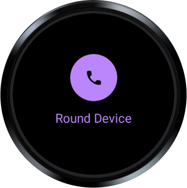
The TextExample() composable function (where we placed our code) now produces a Text composable in our main material color.
The string is pulled from our res/values/strings.xml file. Actually, if you look in the res/values folder, you should see two strings.xml resource files.
So far, so good. Let's look at our last similar composable, Card.
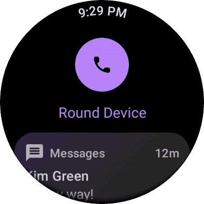
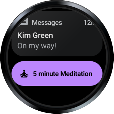
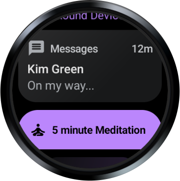
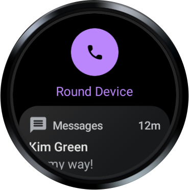
Create a Card composable
In ReusableComponents.kt, search for "TODO: Create a Card" and replace the current composable method with this code.
Step 4
// TODO: Create a Card (specifically, an AppCard) Composable
@Composable
fun CardExample(
    modifier: Modifier = Modifier,
    iconModifier: Modifier = Modifier
) {
    AppCard(
        modifier = modifier,
        appImage = {
            Icon(
                imageVector = Icons.Rounded.Message,
                contentDescription = "triggers open message action",
                modifier = iconModifier
            )
        },
        appName = { Text("Messages") },
        time = { Text("12m") },
        title = { Text("Kim Green") },
        onClick = { /* ... */ }
    ) {
        Text("On my way!")
    }
}
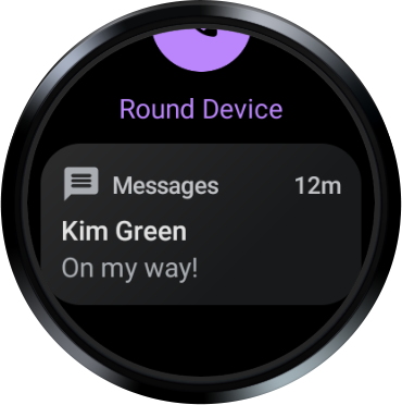
Wear is a little different in that we have two major cards, AppCard and TitleCard.
In our case, we want an Icon in our card, so we are going to use AppCard. (TitleCard has less slots, see Cards guide for more information.)
We create the AppCard composable, set its modifier, add an Icon, add several Text composable parameters (each for a different space on the card), and finally set the main content text at the end.
Let's see what it looks like:
At this point, you probably recognize that for these composables the Compose code is virtually the same as you've used before which is great, right? You get to reuse all that knowledge you've already gained!
Ok, let's look at some new composables.
6. Add Wear Unique Composables
For this section, we will explore the Chip and ToggleChip composables.
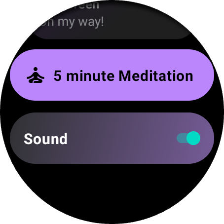
Create a Chip composable
Chips are actually specified in the material guidelines, but there isn't an actual composable function in the standard material library.
They are meant to be a quick, one tap action, which makes especially good sense for a Wear device with limited screen real estate.
Here's a couple variations of the Chip composable function to give you an idea of what you can create:
|
|
|

Let's write some code.
In ReusableComponents.kt, search for "TODO: Create a Chip" and replace the current composable method with this code.
Step 5
// TODO: Create a Chip Composable
@Composable
fun ChipExample(
    modifier: Modifier = Modifier,
    iconModifier: Modifier = Modifier
) {
    Chip(
        modifier = modifier,
        onClick = { /* ... */ },
        label = {
            Text(
                text = "5 minute Meditation",
                maxLines = 1,
                overflow = TextOverflow.Ellipsis
            )
        },
        icon = {
            Icon(
                imageVector = Icons.Rounded.SelfImprovement,
                contentDescription = "triggers meditation action",
                modifier = iconModifier
            )
        },
    )
}
The Chip composable uses many of the same parameters as you are used to with other composables (modifier and onClick), so we don't need to review those.
It also takes a label (which we create a Text composable for) and an icon.
The Icon code should look exactly the same as the code you saw in other composables, but for this one, we are pulling the Self Improvement icon from the androidx.compose.material:material-icons-extended library.
Let's see what it looks like (remember to scroll down):
Ok, let's look at a variation on Toggle, the ToggleChip composable.
Create a ToggleChip composable
ToggleChip is just like a Chip but allows the user to interact with a radio button, toggle, or checkbox.
|
|
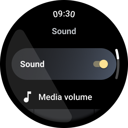
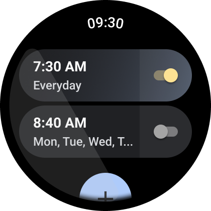
In ReusableComponents.kt, search for "TODO: Create a ToggleChip" and replace the current composable method with this code.
Step 6
// TODO: Create a ToggleChip Composable
@Composable
fun ToggleChipExample(modifier: Modifier = Modifier) {
    var checked by remember { mutableStateOf(true) }
    ToggleChip(
        modifier = modifier,
        checked = checked,
        toggleControl = {
            Switch(
                checked = checked,
                modifier = Modifier.semantics {
                    this.contentDescription = if (checked) "On" else "Off"
                }
            )
        },
        onCheckedChange = {
            checked = it
        },
        label = {
            Text(
                text = "Sound",
                maxLines = 1,
                overflow = TextOverflow.Ellipsis
            )
        }
    )
}
Now the ToggleChipExample() composable function (where this code exists) generates a ToggleChip using a switch toggle (instead of a checkbox or radio button).
First, we create a MutableState. We haven't been doing this in the other functions, because we are mainly doing UI demos so you can see what Wear offers.
In a normal app, you would probably want to pass in the checked state and the lambda for handling the tap, so the composable can be stateless ( more info here).
In our case, we are just keeping it simple to show off what the ToggleChip looks like in action with a working toggle (even though we don't do anything with the state).
Next, we set the modifier, the checked state, and the toggle control to give us the switch we want.
We then create a lambda for changing the state and finally set the label with a Text composable (and some basic parameters).
Let's see what it looks like:
Ok, now you've seen a lot of Wear OS specific composables and, as stated before, most of the code is almost the same as what you've written before.
Let's look at something a little more advanced.
7. Migrate to ScalingLazyColumn
You probably have used LazyColumn in your mobile apps to produce a vertically scrolling list.
Because a round device is smaller at the top and bottom, there is less space to show items. Therefore, Wear OS has its own version of LazyColumn to better support those round devices.
ScalingLazyColumn extends LazyColumn to support both scaling and transparency at the top and bottom of the screen to make the content more readable to the user.
Here's a demo:
Notice how as the item gets near the center it scales up to its full size and then as it moves away it scales back down (along with getting more transparent).
Here is a more concrete example from an app:
We've found this really helps with readability.
Now that you've seen ScalingLazyColumn in action, let's get started converting our LazyColumn.
We will use Horologist ScalinglazyColumn to ensure items in the list have correct padding and are not clipped on different device screen sizes.
Convert to a Horologist ScalingLazyColumnState
In MainActivity.kt, search for "TODO: Swap to ScalingLazyColumnState" and replace that comment and line below with this code, note how we specify which ones are the first and last component so that the best padding values are used to avoid any content clipping.
Step 7
// TODO: Swap to ScalingLazyColumnState
val listState = rememberResponsiveColumnState(
    contentPadding = ScalingLazyColumnDefaults.padding(
        first = ItemType.SingleButton,
        last = ItemType.Chip,
    ),
)
The names are almost identical. Just like LazyListState handles state for a LazyColumn, ScalingLazyColumnState handles it for a ScalingLazyColumn.
Convert to a Horologist ScalingLazyColumn
Next we swap in ScalingLazyColumn.
In MainActivity.kt, search for "TODO: Swap a ScalingLazyColumn". First, replace LazyColumn with Horologist ScalingLazyColumn.
Then remove contentPadding, verticalArrangement, modifier and autocentering altogether - Horologist ScalingLazyColumn already provides default settings that guarantee a better default visual effect as most of the viewport will be filled with list items. In most cases default parameters will be sufficient, if you have header on top we recommend putting it into ResponsiveListHeader as a first item.
Step 8
// TODO: Swap a ScalingLazyColumn (Wear's version of LazyColumn)
ScalingLazyColumn(
    columnState = listState
)
That's it! Let's see what it looks like:
You can see the content is scaled and the transparency is adjusted at the top and bottom of the screen as you scroll with very little work to migrate!
You can really notice it with the meditation composables as you move it up and down.
Now onto the last topic, Wear OS's Scaffold.
8. Add a Scaffold
Scaffold provides a layout structure to help you arrange screens in common patterns, just like mobile, but instead of an App Bar, FAB, Drawer, or other mobile specific elements, it supports four Wear specific layouts with top-level components: time, scroll/position indicator and the page indicator.
Here's what they look like:
| |
| |
|
We'll look at the first three components in detail, but, first, let's put the scaffold in place. We will be using Horologist AppScaffold and ScreenScaffold which add a TimeText by default to the screen and make sure it animates correctly when navigating between screens. Additionally, ScreenScaffold adds a PositionIndicator for scrollable content.
Add a Scaffold
Let's add the boilerplate for the AppScaffold and ScreenScaffold now.
Find "TODO (Start): Create a AppScaffold (Wear Version)" and add the code below it.
Step 9
WearAppTheme {
// TODO (Start): Create a Horologist AppScaffold (Wear Version)
AppScaffold {
Find "TODO (Start): Create a ScreenScaffold (Wear Version)" and add the code below it.
// TODO (Start): Create a Horologist ScreenScaffold (Wear Version)
ScreenScaffold(
    scrollState = listState,
){
Next, make sure you add the closing bracket to the right location.
Find "TODO (End): Create a ScreenScaffold (Wear Version)" and add the bracket there:
Step 10
// TODO (End): Create a ScreenScaffold (Wear Version)
}
Find "TODO (End): Create a AppScaffold (Wear Version)" and add the bracket there:
Step 10
// TODO (End): Create a AppScaffold (Wear Version)
}
Let's run it first. You should see something like this:
Notice that it adds:
- A
TimeTextwhich uses curved text under the hood and gives developers an easy way to show the time without placing the composable or having to do any work with time related classes. Additionally, the Material Guidelines recommend that you display the time at the top of any screen within the app and it fades away while scrolling. - A
PositionIndicator(also known as the Scrolling Indicator) which is an indicator on the right side of the screen to show the current indicator location based on the type of state object you pass in. In our case, that will be theScalingLazyColumnState.
Ok, let's see what this looks like now:
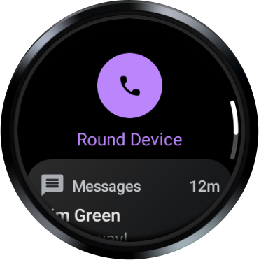
Try scrolling it up and down. You should only see the scrolling indicator show up when you are scrolling.
Nice job, you have finished a UI demo of most of the Wear OS composables!
9. Congratulations
Congratulations! You learned the basics of using Compose on Wear OS!
Now you can reapply all your Compose knowledge to making beautiful Wear OS apps!
What's next?
Check out the other Wear OS codelabs:
Further reading
- Compose for Wear OS is now 1.0 blogpost
- Simple sample of Compose for Wear OS on Github
- Build apps for the wrist with Wear OS for more guides
Feedback
We'd love to hear from you about your experiences using Compose for Wear OS and what you are able to build! Join the discussion in the Kotlin Slack #compose-wear channel and keep providing feedback on the issue tracker.
Happy coding!